How to Make a Positive First Impression with Potential Clients
Part of being a freelancer or an independent designer is communicating with potential clients and landing new work. This is part of the business aspect that is not a favorite with many designers, but it is critical if you want to establish a successful business.
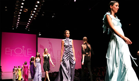
Showcase Of Modern Navigation Design Trends
The navigation menu is perhaps a website’s single most important component. Navigation gives you a window onto the website designer’s creative ability to produce a functional yet visually impressive element that’s fundamental to most websites.

The Analysis Of Great Photography Websites
Photography has not only evolved from a normal pastime to a favorite hobby but also an indispensable living trade for most photographers. The old school method of using roll film has since been replaced with digital photography.

Embedding Social Media Channels in Modern Web Design
Well the Twitter stream integration is almost a standard these days when designing a portfolio website, but there are some brands with a more complex view when it comes to social media integration.

Extreme And Creative Free Grunge Fonts
Grunge, dirty, fancy typography and artworks are very popular design trend in our days, so I wanted to showcase here most popular and professionally executed fonts in my opinion. Unleash your dirty side and create some fresh design mixing font size, color, textures together – try something new if you haven’t done it yet!

Creative Free Icon Set for Web Developers: Coded
Posted by Talib Imran on 2:21 AM


Free SEO Accounts From My SEO Tool
Posted by Talib Imran on 7:58 AM

How Can My SEO Tool Help You
As a web designer, you may have been in and out of the SEO trenches more than a few times. When it comes to creating a new website design and content, focusing on SEO is not a simple task. It’s hard enough to know what your SEO strategy should target, but it is even tougher to manage and track its results. This was the motivation behind My SEO Tool - Online SEO software specifically developed for web designers.
Real-Time Traffic, Ranking & Activity Updates
The most important aspect of SEO is understanding your current situation. My SEO Tool keeps you informed by providing real-time activity updates.

Easy On-Page Optimization
Follow the optimization wizard to quickly identify & fix SEO issues. You will be amazed how little changes can affect your rankings.

Build Links Quickly & Effortlessly
Getting other websites to link to yours can be tiresome & repetitive. My SEO Tool simplifies this process by breaking it down into bite-size tasks.

Track the Results of your SEO Campaign
My SEO Tool allows you to track rankings and traffic over the entire life-cycle of your SEO campaign.

Create or Improve your SEO Service
Interested in offering SEO to your existing clients? Use My SEO Tool branding features to customize your interface and generate specialized reports.

Learning to Love HTML5
Posted by Talib Imran on 9:35 AM
It seems that new resources and articles for teaching and promoting HTML5 are popping up almost daily. We’ve been given HTML5 templates in the form of the HTML5 boilerplate and HTML5 Reset (although they both go beyond just HTML5 stuff). We’ve got a plethora of books to choose from that cover HTML5 and its related technologies. We’ve got shivs, galleries, and a physician to help heal your HTML5 maladies. And don’t forget the official spec.
From my own vantage point — aside from a few disputes about what the term “HTML5″ should and shouldn’t mean — the web design and development community has for the most part embraced all the new technologies and semantics with a positive attitude.
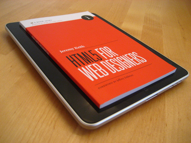
Flickr Photo by Jeremy Keith
While it’s certainly true that HTML5 has the potential to change the web for the better, the reality is that these kinds of major changes can be difficult to grasp and embrace. I’m personally in the process of gaining a better understanding of the subtleties of HTML5′s various new features, so I thought I would discuss some things associated with HTML5 that appear to be somewhat confusing, and maybe this will help us all understand certain aspects of the language a little better, enabling us to use the new features in the most practical and appropriate manner possible.
The Good (and Easy) Parts
The good stuff in HTML5 has been discussed pretty solidly in a number of sources including books by Bruce Lawson, Jeremy Keith, and Mark Pilgrim, to name a few. The benefits gained from using HTML5 include improved semantics, reduced redundancies, and inclusion of new features that minimize the need for complex scripting to achieve standard tasks (like input validation in forms, for example).
I think those are all commendable improvements in the evolution of the web’s markup language. Some of the improvements, however, are a little confusing, and do seem to be a bit revolutionary, as opposed to evolutionary, the latter of which is one of the design principles on which HTML5 is based. Let’s look at a few examples, so we can see how flexible and valuable some of the new elements really are — once we get past some of the confusion.
An Isn’t Just an Article
Among the additions to the semantic elements are the new
tags that we’re all accustomed to in XHTML. The problem arises when we try to decipher how these tags should be used.
Article tags can be nested inside article tags — a concept that seems confusing at first glance.
Someone new to the language would probably assume that an
Let’s consider a blog post as an example, which is the same example used in the spec. Naturally, we would think a blog post marked up in HTML5 would look something like this:
Title of Post
Content of post... Content of post...Comment by: Comment Author Comment #1 goes here... Comment by: Comment Author Comment #2 goes here... Comment by: Comment Author Comment #3 goes here...
For brevity, I’ve left out some of the other HTML5 tags that might go into such an example. In this example, the
It would not be invalid or wrong to structure a blog post like this. But according to the way
Below is a screen grab from the spec, with
Article tags can be nested inside article tags — a concept that seems confusing at first glance.
So, an
“Think ofnot in terms of print, like “newspaper article” but as a discrete entity like “article of clothing” that is complete in itself, but can also mix with other articles to make a wider ensemble.”
— Bruce Lawson
So keep in mind that you can nest
Section or Article?
Probably one of the most confusing things to figure out when creating an HTML5 layout is whether or not to use
“Thearticleelement is [a] specialized kind ofsection. Use it for self-contained related content… Ask yourself if you would syndicate the content in an RSS or Atom feed. If the content still makes sense in that context, thenarticleis probably the right element to use.”
— Jeremy Keith, HTML5 for Web Designers
Keith’s explanation helps a lot, but then he goes on to explain that the difference between
As a result, you might wonder why we have both. The main difference is that the
Headers and Footers (Plural!)
Two other elements introduced in HTML5 are the
,
Post-Production Trends in 3D Visualizations
Posted by Talib Imran on 8:59 AM
Post-production might well be the most under appreciated part of creating 3D visualizations. It gives you the power to easily make some changes; put in the sky you like, add some dirt, make the colors more vibrant and even correct some little mistakes in your 3D mesh.
Most of the traditional 3D artists tried to do as much as possible within their 3D package since these packages were not focusing on post, but rather on the 3D products themselves. Rendering masks for the different color corrections one would like to do was a painstaking job of fixing the lighting and materializing — making artists choose to do most of the work in 3D (such as adding dirt and textures) and so leaving only color correction for post-work.
The techniques and styles of correcting images in post-production have changed a lot over the last couple of years. First, we shall take a look at some of the trends and techniques that are happening right now. Next to that, we will take a look at the most impressive architectural visualization shot that CGI has ever seen and at the post-production in that shot. Next to that, the trend it started in terms of post-production.
Different Styles of Post-Production
This is what a 3D image should look like according to the corporate industry. Basically, what you do is the following: take a render, do some minor color correction and add some glow. Despite the fact that this is mostly considered standard, it should belong to the past. There are a lot of techniques out now to create better looking, more beautiful images with the help of post-production software. Let’s look at some examples.

This image, created by a Dutch company called “Trazar” explains exactly what the “standard” is. The image looks great and a client would absolutely love it because the building is so clearly visible, but it looks too perfect. So to a 3D specialist, it still looks fake.
Some things that immediately come to mind:
- Everything is completely balanced; you can see the sky clearly (it is not too bright), but you can also see every little detail in the shadows.
- There is a blank spot at the horizon, which is odd, because it’s situated in the middle of a city.
Here is another example, made by a company called “Archiform”. This render too looks very realistic, but still doesn’t look quite as good as it could with some heavy post production.

Same thing here:
- The colors are too vibrant.
- The glow of the sky makes the trees blue
Degraded Photorealism
A synopsis to explain what I’m talking about. Degrading your images in post with scratches, vignetting, lens blur and many more things, making your image look more like a photo taken by a (bad or old) camera that uses film rather then a 3D render. What we make in our 3D packages can look perfect: our edges can be exactly 90 degrees (or 89 for that matter), our tabletops can be completely clean without dents in them, as well as that we can produce images in low light condition with an ISO of 6400 without a single drop of grain in the final images.
This technique focuses on how to overcome the perfectness of 3D. It is unmistakably the most popular post-production trend at the moment used in non-corporate 3D visuals. Let’s look at the only example needed to illustrate this technique. This video is made by Alex Roman, a 3D visualization expert.
The Third & The Seventh by Alex Roman.
Now, the first thing that’s noteworthy is that everything except the people and the birds is 3D. The art of 3D visuals has come a long way and if we would give a good 3D artist one year of free time on his hands to make whatever he wants, this is what he would come up with (at least, “Alex Roman” did).
Alex Roman’s “The Third & The Seventh” shook-up the 3D world by using a great cinematic style to make the architecture stand out. Most of the time, you don’t even realize it’s 3D.
So, what part of this is done in his 3D package, and what part is done in post? To let Alex answer the question himself, here is another video of the composting breakdown. He shows a wireframe or smooth shaded view of the model inside 3D studio max, after that the bare render. Each next frame includes a new step of post-production.
Composting Breakdown (T&S) by Alex Roman.
As we can clearly see he replaced the sky, added people, corrected the color and added some other visual elements in post. Those things are purely decorative. What really sets the mood, is the use of vignetting, lens flares and lens blur. He makes it look like this was a movie shot in the early nineties. Don’t get confused, it is not only the post-production that made this mood happen (cameramen wearing somewhat classic clothing, etc.), but this is certainly something that helps a lot! This movie would have been completely different if it hadn’t been corrected in post.
Techniques
Let’s discuss how we can achieve this effect, and look at the stuff that will work, and how the same stuff, applied in a wrong way, won’t work. In the examples below, these effects have been exaggerated to see the difference clearer. I’ve had to limit myself to a couple effects since it is simply too much to discuss all of the techniques that can be used. The ones I’ll describe below should get the basics though.

When using old cameras with film, there are pictures that often show grain in the darker areas of the image because the film won’t pick up the details in the darker part of the image. This effect can easily be achieved in our post-production package. I used photoshop in this case.
Do:
- Make the effect barely visible, only noticeable if you look good.
- Use plugins like “NIK color effects” that can simulate actual grain from a certain film. This will boost the credibility of the grain.
Don’t:
- Add noise in brighter areas of the image, this will look unrealistic.
- Overdo it. Some noise is good, but don’t make it disturbing, the end product should still look good.

Vignetting can have different causes in photography. The main cause is using a cheap lens / camera. Most of the time this effect is unwanted, but sometimes it can create an image that centers your eye, or guides it to a specific part of the image.
In post, we can use two types of vignetting; one brightens the middle of the image, the other darkens the edges. Normally, the second one is used, since the 3D render still has to maintain its function of showing the subject properly 6mdash; if it’s too bright, this isn’t always possible.
Do:
- Add vignetting to your renders! It looks cool.
Don’t:
- Tell your client about is, they won’t like that you are degrading otherwise perfect images just too make them look cool. If you use this effect moderately, they probably won’t even notice.
- Overdo the effect. This will make your image look very dark, and might not fit its purpose.
- Add them when you are rendering studio setups and such. The effect needs to be believable. Studio cameras are often setup to not have vignetting; so when applied in this case, it won’t look realistic but rather disturbing.

Chromatic aberrations are caused by a lens that refracts the light spectrum in different ways on different places. Like with a prism, the light will disperse and fall on the sensor incorrectly.The effect will occur more on wide-angle lenses rather then tele-lenses.
It’s is a very subtle effect and will pretty much only show up in the corners and on the side of the images (unless your camera equipment is really bad). If you look in the circle drawn in the image above at the black beam, there is a red, blurry line next to it, that’s chromatic aberration (CA).
Do:
- Use it (heavily) when you have rendered with a wide angle lens and adapt the amount of chromatic aberrations when using a tele-lens.
- Make sure you use the correct color slider; the most often occurring colors of CA are red and green. In photoshop, you can also make blue and yellow ones.
Don’t:
- Overdo the effect (again? yes again!). This is really important. All of these effects should be only very subtle to make them work. You are trying to make it look like a stylized photo, not like you screwed up your image in post.
- Add it in the center of the image, it will look disturbing instead of realistic.
- Add it in the beginning of the post; make sure to make this one of your last steps so that the colors of the aberrations are not effected by your color corrections.

This is were the fun begins. Color correction. The most common thing is to look at “lomography” photographs; they have huge amounts of saturation, produce those artifacts we want to see, and still manage to look stunning. This step is somewhat personal, and I can see why some people don’t like this effect, but I personally like to take this step over the top.
In this image I’ve added a bunch of adjustment layers:
- Three gradient maps (set to various blending modes).
- One color balance.
- One black & white layer set to soft light.
- A levels adjustment.
All of the layers have a very low opacity (less than 25%) to make the effects subtle, but visible. A little side note; before I added these, I made sure my image was “correct”. No overexposed areas, no huge amounts of contrast and no unsharp areas.
Now, all of these effects standing alone might not be very cool, but added together, it gives a completely different feel to the scene.

One thing to keep in mind, is that the render you start out with, has to look good already. It has to look somewhat photorealistic to make these effects work. If you start out with a simple render with simple materials that on its own doesn’t look convincing; you should work on those qualities first. After that, you can let yourself go in post to degrade the images again.
Next to the effects described above, there is a ton of stuff you can add; blooming, lens flares, haze, depth of field, motion blur, etc. I have just scratched the surface here. Check the “More to Read & Watch” section for some tutorials and interesting articles.
Hybrid 2D / 3D Visualization
Another upcoming trend is to use 2D in conjunction with 3D to create pictures that look like they were painted or drawn, but were the geometry was made in 3D. This movie is made by CMI studio — this technique is relatively new and uncommon, but I think it’s noteworthy simply because it looks great! Let’s look at an example of this technique:
If you take a good look at the movie, you will find a lot of things that are peculiar, and normally don’t happen in a 3D company. The rendered image is printed out, drawn over, the drawing is scanned, and that is the one getting color. So the 3D part isn’t visible in the end product at all! Check the “More to Read & Watch” section for some “making of” videos. I think this is one of the upcoming new things that will become greatly used in the upcoming years.
Wrapping Up
The last couple of years, the amount of post-production has grown, most things are easier to add into post, than in your 3D package.
Despite the fact that it has been growing in the corporate way (Because that’s where the money is), I think artist will start showing more of what they can do in post, and the companies buying 3D renders will soon realize that stylized images look much better than the plain, blend ones without some sort of a feeling too it. Adding real-life imperfections to your renders should be something that has to be done a lot more often.
Nothing in the world is perfect, your 3D renders shouldn’t be either!


