How to Make a Positive First Impression with Potential Clients
Part of being a freelancer or an independent designer is communicating with potential clients and landing new work. This is part of the business aspect that is not a favorite with many designers, but it is critical if you want to establish a successful business.
Showcase Of Modern Navigation Design Trends
The navigation menu is perhaps a website’s single most important component. Navigation gives you a window onto the website designer’s creative ability to produce a functional yet visually impressive element that’s fundamental to most websites.
The Analysis Of Great Photography Websites
Photography has not only evolved from a normal pastime to a favorite hobby but also an indispensable living trade for most photographers. The old school method of using roll film has since been replaced with digital photography.
Embedding Social Media Channels in Modern Web Design
Well the Twitter stream integration is almost a standard these days when designing a portfolio website, but there are some brands with a more complex view when it comes to social media integration.

Extreme And Creative Free Grunge Fonts
Grunge, dirty, fancy typography and artworks are very popular design trend in our days, so I wanted to showcase here most popular and professionally executed fonts in my opinion. Unleash your dirty side and create some fresh design mixing font size, color, textures together – try something new if you haven’t done it yet!

Creative Free Icon Set for Web Developers: Coded
Posted by Talib Imran on 2:21 AM


Free SEO Accounts From My SEO Tool
Posted by Talib Imran on 7:58 AM

How Can My SEO Tool Help You
As a web designer, you may have been in and out of the SEO trenches more than a few times. When it comes to creating a new website design and content, focusing on SEO is not a simple task. It’s hard enough to know what your SEO strategy should target, but it is even tougher to manage and track its results. This was the motivation behind My SEO Tool - Online SEO software specifically developed for web designers.
Real-Time Traffic, Ranking & Activity Updates
The most important aspect of SEO is understanding your current situation. My SEO Tool keeps you informed by providing real-time activity updates.

Easy On-Page Optimization
Follow the optimization wizard to quickly identify & fix SEO issues. You will be amazed how little changes can affect your rankings.

Build Links Quickly & Effortlessly
Getting other websites to link to yours can be tiresome & repetitive. My SEO Tool simplifies this process by breaking it down into bite-size tasks.

Track the Results of your SEO Campaign
My SEO Tool allows you to track rankings and traffic over the entire life-cycle of your SEO campaign.

Create or Improve your SEO Service
Interested in offering SEO to your existing clients? Use My SEO Tool branding features to customize your interface and generate specialized reports.

Learning to Love HTML5
Posted by Talib Imran on 9:35 AM
It seems that new resources and articles for teaching and promoting HTML5 are popping up almost daily. We’ve been given HTML5 templates in the form of the HTML5 boilerplate and HTML5 Reset (although they both go beyond just HTML5 stuff). We’ve got a plethora of books to choose from that cover HTML5 and its related technologies. We’ve got shivs, galleries, and a physician to help heal your HTML5 maladies. And don’t forget the official spec.
From my own vantage point — aside from a few disputes about what the term “HTML5″ should and shouldn’t mean — the web design and development community has for the most part embraced all the new technologies and semantics with a positive attitude.
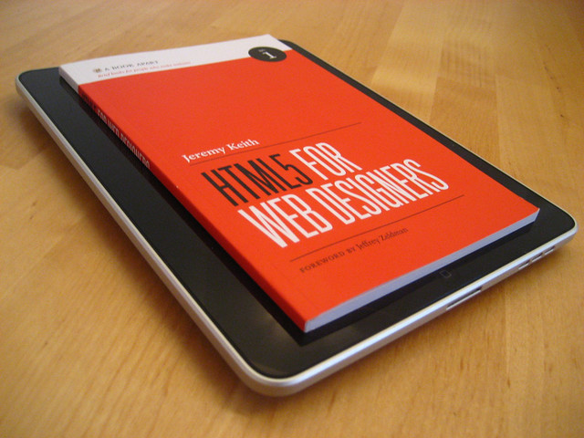
Flickr Photo by Jeremy Keith
While it’s certainly true that HTML5 has the potential to change the web for the better, the reality is that these kinds of major changes can be difficult to grasp and embrace. I’m personally in the process of gaining a better understanding of the subtleties of HTML5′s various new features, so I thought I would discuss some things associated with HTML5 that appear to be somewhat confusing, and maybe this will help us all understand certain aspects of the language a little better, enabling us to use the new features in the most practical and appropriate manner possible.
The Good (and Easy) Parts
The good stuff in HTML5 has been discussed pretty solidly in a number of sources including books by Bruce Lawson, Jeremy Keith, and Mark Pilgrim, to name a few. The benefits gained from using HTML5 include improved semantics, reduced redundancies, and inclusion of new features that minimize the need for complex scripting to achieve standard tasks (like input validation in forms, for example).
I think those are all commendable improvements in the evolution of the web’s markup language. Some of the improvements, however, are a little confusing, and do seem to be a bit revolutionary, as opposed to evolutionary, the latter of which is one of the design principles on which HTML5 is based. Let’s look at a few examples, so we can see how flexible and valuable some of the new elements really are — once we get past some of the confusion.
An Isn’t Just an Article
Among the additions to the semantic elements are the new
tags that we’re all accustomed to in XHTML. The problem arises when we try to decipher how these tags should be used.
Article tags can be nested inside article tags — a concept that seems confusing at first glance.
Someone new to the language would probably assume that an
Let’s consider a blog post as an example, which is the same example used in the spec. Naturally, we would think a blog post marked up in HTML5 would look something like this:
Title of Post
Content of post... Content of post...Comment by: Comment Author Comment #1 goes here... Comment by: Comment Author Comment #2 goes here... Comment by: Comment Author Comment #3 goes here...
For brevity, I’ve left out some of the other HTML5 tags that might go into such an example. In this example, the
It would not be invalid or wrong to structure a blog post like this. But according to the way
Below is a screen grab from the spec, with
Article tags can be nested inside article tags — a concept that seems confusing at first glance.
So, an
“Think ofnot in terms of print, like “newspaper article” but as a discrete entity like “article of clothing” that is complete in itself, but can also mix with other articles to make a wider ensemble.”
— Bruce Lawson
So keep in mind that you can nest
Section or Article?
Probably one of the most confusing things to figure out when creating an HTML5 layout is whether or not to use
“Thearticleelement is [a] specialized kind ofsection. Use it for self-contained related content… Ask yourself if you would syndicate the content in an RSS or Atom feed. If the content still makes sense in that context, thenarticleis probably the right element to use.”
— Jeremy Keith, HTML5 for Web Designers
Keith’s explanation helps a lot, but then he goes on to explain that the difference between
As a result, you might wonder why we have both. The main difference is that the
Headers and Footers (Plural!)
Two other elements introduced in HTML5 are the
,
Post-Production Trends in 3D Visualizations
Posted by Talib Imran on 8:59 AM
Post-production might well be the most under appreciated part of creating 3D visualizations. It gives you the power to easily make some changes; put in the sky you like, add some dirt, make the colors more vibrant and even correct some little mistakes in your 3D mesh.
Most of the traditional 3D artists tried to do as much as possible within their 3D package since these packages were not focusing on post, but rather on the 3D products themselves. Rendering masks for the different color corrections one would like to do was a painstaking job of fixing the lighting and materializing — making artists choose to do most of the work in 3D (such as adding dirt and textures) and so leaving only color correction for post-work.
The techniques and styles of correcting images in post-production have changed a lot over the last couple of years. First, we shall take a look at some of the trends and techniques that are happening right now. Next to that, we will take a look at the most impressive architectural visualization shot that CGI has ever seen and at the post-production in that shot. Next to that, the trend it started in terms of post-production.
Different Styles of Post-Production
This is what a 3D image should look like according to the corporate industry. Basically, what you do is the following: take a render, do some minor color correction and add some glow. Despite the fact that this is mostly considered standard, it should belong to the past. There are a lot of techniques out now to create better looking, more beautiful images with the help of post-production software. Let’s look at some examples.

This image, created by a Dutch company called “Trazar” explains exactly what the “standard” is. The image looks great and a client would absolutely love it because the building is so clearly visible, but it looks too perfect. So to a 3D specialist, it still looks fake.
Some things that immediately come to mind:
- Everything is completely balanced; you can see the sky clearly (it is not too bright), but you can also see every little detail in the shadows.
- There is a blank spot at the horizon, which is odd, because it’s situated in the middle of a city.
Here is another example, made by a company called “Archiform”. This render too looks very realistic, but still doesn’t look quite as good as it could with some heavy post production.

Same thing here:
- The colors are too vibrant.
- The glow of the sky makes the trees blue
Degraded Photorealism
A synopsis to explain what I’m talking about. Degrading your images in post with scratches, vignetting, lens blur and many more things, making your image look more like a photo taken by a (bad or old) camera that uses film rather then a 3D render. What we make in our 3D packages can look perfect: our edges can be exactly 90 degrees (or 89 for that matter), our tabletops can be completely clean without dents in them, as well as that we can produce images in low light condition with an ISO of 6400 without a single drop of grain in the final images.
This technique focuses on how to overcome the perfectness of 3D. It is unmistakably the most popular post-production trend at the moment used in non-corporate 3D visuals. Let’s look at the only example needed to illustrate this technique. This video is made by Alex Roman, a 3D visualization expert.
The Third & The Seventh by Alex Roman.
Now, the first thing that’s noteworthy is that everything except the people and the birds is 3D. The art of 3D visuals has come a long way and if we would give a good 3D artist one year of free time on his hands to make whatever he wants, this is what he would come up with (at least, “Alex Roman” did).
Alex Roman’s “The Third & The Seventh” shook-up the 3D world by using a great cinematic style to make the architecture stand out. Most of the time, you don’t even realize it’s 3D.
So, what part of this is done in his 3D package, and what part is done in post? To let Alex answer the question himself, here is another video of the composting breakdown. He shows a wireframe or smooth shaded view of the model inside 3D studio max, after that the bare render. Each next frame includes a new step of post-production.
Composting Breakdown (T&S) by Alex Roman.
As we can clearly see he replaced the sky, added people, corrected the color and added some other visual elements in post. Those things are purely decorative. What really sets the mood, is the use of vignetting, lens flares and lens blur. He makes it look like this was a movie shot in the early nineties. Don’t get confused, it is not only the post-production that made this mood happen (cameramen wearing somewhat classic clothing, etc.), but this is certainly something that helps a lot! This movie would have been completely different if it hadn’t been corrected in post.
Techniques
Let’s discuss how we can achieve this effect, and look at the stuff that will work, and how the same stuff, applied in a wrong way, won’t work. In the examples below, these effects have been exaggerated to see the difference clearer. I’ve had to limit myself to a couple effects since it is simply too much to discuss all of the techniques that can be used. The ones I’ll describe below should get the basics though.

When using old cameras with film, there are pictures that often show grain in the darker areas of the image because the film won’t pick up the details in the darker part of the image. This effect can easily be achieved in our post-production package. I used photoshop in this case.
Do:
- Make the effect barely visible, only noticeable if you look good.
- Use plugins like “NIK color effects” that can simulate actual grain from a certain film. This will boost the credibility of the grain.
Don’t:
- Add noise in brighter areas of the image, this will look unrealistic.
- Overdo it. Some noise is good, but don’t make it disturbing, the end product should still look good.

Vignetting can have different causes in photography. The main cause is using a cheap lens / camera. Most of the time this effect is unwanted, but sometimes it can create an image that centers your eye, or guides it to a specific part of the image.
In post, we can use two types of vignetting; one brightens the middle of the image, the other darkens the edges. Normally, the second one is used, since the 3D render still has to maintain its function of showing the subject properly 6mdash; if it’s too bright, this isn’t always possible.
Do:
- Add vignetting to your renders! It looks cool.
Don’t:
- Tell your client about is, they won’t like that you are degrading otherwise perfect images just too make them look cool. If you use this effect moderately, they probably won’t even notice.
- Overdo the effect. This will make your image look very dark, and might not fit its purpose.
- Add them when you are rendering studio setups and such. The effect needs to be believable. Studio cameras are often setup to not have vignetting; so when applied in this case, it won’t look realistic but rather disturbing.

Chromatic aberrations are caused by a lens that refracts the light spectrum in different ways on different places. Like with a prism, the light will disperse and fall on the sensor incorrectly.The effect will occur more on wide-angle lenses rather then tele-lenses.
It’s is a very subtle effect and will pretty much only show up in the corners and on the side of the images (unless your camera equipment is really bad). If you look in the circle drawn in the image above at the black beam, there is a red, blurry line next to it, that’s chromatic aberration (CA).
Do:
- Use it (heavily) when you have rendered with a wide angle lens and adapt the amount of chromatic aberrations when using a tele-lens.
- Make sure you use the correct color slider; the most often occurring colors of CA are red and green. In photoshop, you can also make blue and yellow ones.
Don’t:
- Overdo the effect (again? yes again!). This is really important. All of these effects should be only very subtle to make them work. You are trying to make it look like a stylized photo, not like you screwed up your image in post.
- Add it in the center of the image, it will look disturbing instead of realistic.
- Add it in the beginning of the post; make sure to make this one of your last steps so that the colors of the aberrations are not effected by your color corrections.

This is were the fun begins. Color correction. The most common thing is to look at “lomography” photographs; they have huge amounts of saturation, produce those artifacts we want to see, and still manage to look stunning. This step is somewhat personal, and I can see why some people don’t like this effect, but I personally like to take this step over the top.
In this image I’ve added a bunch of adjustment layers:
- Three gradient maps (set to various blending modes).
- One color balance.
- One black & white layer set to soft light.
- A levels adjustment.
All of the layers have a very low opacity (less than 25%) to make the effects subtle, but visible. A little side note; before I added these, I made sure my image was “correct”. No overexposed areas, no huge amounts of contrast and no unsharp areas.
Now, all of these effects standing alone might not be very cool, but added together, it gives a completely different feel to the scene.

One thing to keep in mind, is that the render you start out with, has to look good already. It has to look somewhat photorealistic to make these effects work. If you start out with a simple render with simple materials that on its own doesn’t look convincing; you should work on those qualities first. After that, you can let yourself go in post to degrade the images again.
Next to the effects described above, there is a ton of stuff you can add; blooming, lens flares, haze, depth of field, motion blur, etc. I have just scratched the surface here. Check the “More to Read & Watch” section for some tutorials and interesting articles.
Hybrid 2D / 3D Visualization
Another upcoming trend is to use 2D in conjunction with 3D to create pictures that look like they were painted or drawn, but were the geometry was made in 3D. This movie is made by CMI studio — this technique is relatively new and uncommon, but I think it’s noteworthy simply because it looks great! Let’s look at an example of this technique:
If you take a good look at the movie, you will find a lot of things that are peculiar, and normally don’t happen in a 3D company. The rendered image is printed out, drawn over, the drawing is scanned, and that is the one getting color. So the 3D part isn’t visible in the end product at all! Check the “More to Read & Watch” section for some “making of” videos. I think this is one of the upcoming new things that will become greatly used in the upcoming years.
Wrapping Up
The last couple of years, the amount of post-production has grown, most things are easier to add into post, than in your 3D package.
Despite the fact that it has been growing in the corporate way (Because that’s where the money is), I think artist will start showing more of what they can do in post, and the companies buying 3D renders will soon realize that stylized images look much better than the plain, blend ones without some sort of a feeling too it. Adding real-life imperfections to your renders should be something that has to be done a lot more often.
Nothing in the world is perfect, your 3D renders shouldn’t be either!
The Characteristics of a Less Conventional Website with Examples
Posted by Talib Imran on 12:44 PM
The evolution of web design has changed significantly since the creation of the internet. Back then, a Geocity webpage could be as simple as a brochure, using a multi colored background and gaudy text effects. It is interesting to note with the progress of technology, websites become more complicated; codes come into play and incredible design techniques are produced.
People spotted this power, the power of the internet that had advanced so rapidly that there was a boom in this industry. Websites became more visually compelling with effects becoming more eye-popping.

Dissection of Web Layout
These days in web design, the focus of creative layouts is used to draw the attention of users. The current state of most web pages is designed to cater to the eye of readers where readers would start scanning with many fixations from the upper left of the page. This was quite evident from the early days of web design where it is similar to today's conventional wireframe of a webpage shown below.
By dissecting both old and new sites, we can spot similarities between the two layouts. The master heads, navigations and content are placed at the same areas.

Characteristics of a Less Conventional Website
The Undefined Grid
Using a grid layout is a great way of displaying your content and images neatly. However, breaking away from the strict grid layout is a great way of establishing a contemporary and fresh non-typical layout website. Even though unconventional websites do not follow the suggested grids, they are still able to achieve usability, allowing users to glance and read the page at ease.
Undefined grid layouts can be a little hard to achieve usability, but if you are able to pull it off, it would definitely give your site an element of fun and energy.
Great Splash of Images
Filling the background with a professionally taken photo doctored by skillful photo editing, makes the site look like a full-screen flash site. Images play a very important role here because they are huge and they almost fill the full screen of the browser. They should be visually appealing and/or impactful to the eye.
Overlaying the image with a slightly transparent box for your content, helps the reader to read them more clearly.
Scrolling Horizontally
Vertical scrolling is the most common way of scrolling web pages. However, websites that allow scrolling horizontally only gives a magazine-like feel to the site. Scrolling horizontally may be a chore at first, because you are unable to use the scroller on mouse, but you would get used to it because many of such sites now uses JavaScript, so the page would animate horizontally just by clicking on the navigation buttons.
Most of the time, horizontal scrolling occurs in sites with lesser content and more images, such as photography portfolio sites.
Slim Vertical Layout
This is a less popular option to go unconventional. The main navigation and content is placed right after each other in a straight row. This means that the user eye will be scanning the page within the vertical zone of this layout. Such a layout should be designed carefully, as the page would get very long if content is heavy. Scrolling too much is not advisable.
Showcases- Bringing the Modernist Layout into Web
Tomas PojetaThis site contains rich illustrations, filling up the whole screen of the browser. There is no typical navigation bar sitting on top or at the side of the screen. Its navigation is placed at the top or bottom right of the screen, and navigation in this site is almost linear. Scrolling up and down the site, feels as if you are looking through a brochure-like website.

Bada Bing
Bada Bing site is also filled with an image that fills the whole browser. The interesting placement of the main navigation beside the logo, gives easy access to the other pages. Its homepage consist of an interesting animation- the image moves vertically and its content moves horizontally. Although it still uses some elements of a common web layout, the positioning of content, images and navigation makes this web page interesting and experimental.

Kustaa Saksi
Although Kustaa Saksi's site follows a grid-like layout, it still looks rather experimental because the navigation is camouflaged with images. Users are required to rollover the images in order to find out what the link is about. The overall layout is neat, simple with a hint of a modern look.

Camellie's Portfolio
The navigation bar in Camellie's portfolio site is placed at the bottom, somewhat hidden in the beautiful and detailed illustration. Of course web design experts may argue that the navigation is the gate way to the other pages of your site and it should be placed at a prominent area. In this case, it is the total opposite. In fact, the illustration helps to lead the eye to the navigation at the bottom left.

Work At Play
This is another company site that uses JavaScript to animate the pages, moving them horizontally. In every link, the background is filled with a black and white image, contents are all placed vertically, and there is minimal horizontal scrolling.

Aspired Mind
It is quite impossible to define the layout of this site. The navigation is placed within the typography on the left. One may not know how to navigate through the site at one glance, but with the help of the floating blue bubble, it tells the user what exactly they are clicking on.

Fudge
This site uses the layout interface of Photoshop. The homepage is not scrollable except for the center column. Although grids are quite evident here, it is an interesting way of displaying information because it has adopted the look of a print media for the web.

Only 2 Designers
This site shows the characteristics of a slim vertical layout. The width of the white canvas does not expand when contents are loaded within that area. Its contents are concentrated within the white spaces, and no scrolling up and down is required. Such rare layouts should be designed with care, as the page will get very long when content gets heavy.

FM & M Management
With the advancement of scripting, more websites are starting to look flash-like. This site consists of a professionally taken image, with simple graphic elements overlaying on top of the image. Subtle animation and choice of colors, gives this site a contemporary look.

Rezoactif
The use of 3D graphics gives a futuristic look to websites. Typography, the choice of color and the play of lighting, plays a big part to disguise a simple table in this layout.

DesignYour Life
Design Your Life is a photography showcase website where users scroll vertically. Scrolling horizontally engages the users differently, providing a different viewing experience to them.

Frozn
Drop down menus are a great way to hide links when there are too many of them. This site contains interaction cues to help the user to look for these hidden links in the page. It uses an uncommon table layout that is expandable when users click on the arrows.

Leg Work Studio
Line art is the main focus in this website. Pages animate vertically in a swift action when users click on the links. Although it uses traditional style of illustration in all the pages, animation is used effectively to help enliven the site.

Towards An Experimental Future
Through the years, professionals have set certain standards for designing the web. However, with the recent rapid outburst of designers and professionals in the creative industry, web design principles are gradually altered. This alteration is being accepted by users. And this acceptance will modify users’ knowledge of interactive cues and habits of surfing the net. Who knows, going experimental might be the next hot trend on the web.
Anatomy of Colors in Web Design: Yellow and the Sunshine Feel
Posted by Talib Imran on 12:21 PM
This is the third article of our series, Anatomy of Colors in Web Design. Over the next few months, we’ll continue to cover a spectrum of colors. And one color at a time, we will be featuring web design from around the world. If you have missed past articles in the series, you may want to catch up and read our articles on the colors Green and Blue. Today’s article will explore the use of the color yellow in Web design. Please remember to continue watching this space, as we take a closer look at other colors in upcoming months.
Subscribe to our RSS feed or Follow us on Twitter so that you won’t miss the full series.
Color is everywhere! Although it wasn’t too long ago that we lived in the era of black and white television and film, color has always and will continue to play an important role in our lives. The color yellow is most commonly associated with our sun. It’s bright, striking and sometimes overpowering rays is a symbol of our earth’s humble beginning. With this article, we take a look at the impact the color yellow has made in our lives.
Some painters transform the sun into a yellow spot; others transform a yellow spot into the sun. - Pablo Picasso
Definition of Yellow
Yellow is the color evoked by light that stimulates both the L and M (long and medium wavelength) cone cells of the retina about equally, with no significant stimulation of the S (short-wavelength) cone cells. Light with a wavelength of 570–580 nm is yellow, as is light with a suitable mixture of somewhat longer and shorter wavelengths. Yellow's traditional RYB complementary color is purple, violet, or indigo, while its colorimetrically defined complementary color in both RGB and CMYK color spaces is blue.

Image courtesy from Wikimedia Commons
Why Choose Yellow?
Yellow is often represented as the color of sunshine, sunflowers, and all else related to the sun. It is a color associated with joy, happiness, intellect and boundless energy.
The color yellow gives one a warm and cosy effect. It also arouses cheerfulness, stimulates mental activity, and generates muscle energy. Yellow is also often associated with food. Pure yellow is very bright and often attracts one’s attention. This is probably one of the reasons why taxi cabs are often painted bright yellow. However, when over used, yellow can create a disturbing effect; in fact, those of you planning to paint your baby’s nursery room yellow because it’s a gender neutral color, think twice because babies cry more in yellow colored rooms.

Ever notice that most warning signs are often a combination of yellow against a black background? The yellow and black combination produces the best contrast compared to any other color. Thus, this combination is often used in warning or danger signs. In heraldry, yellow is the color symbolising honor and loyalty. Ironically, yellow is also a color associated with cowardice.
Often chosen to promote children’s products and leisure or entertainment items, yellow evokes a pleasant and cheery disposition in people. Because of yellow’s talent for attracting one’s attention, it is often used to highlight the important elements in your design. Commonly perceived by men as a light hearted and childish color, yellow is not a recommended color to use when trying to sell prestigious or luxurious products – which rational man would buy a bright yellow business suit or a yellow Mercedes?
Seen as spontaneous and sometimes over the top, avoid using yellow if your underlying subtext is to portray stability and safety.
Seen as spontaneous and sometimes over the top, avoid using yellow if your underlying subtext is to portray stability and safety.
Yellow is at its best when used in its purest form and at its brightest. Add too much white and it because pale and sickly. Muddy it too much with black and it becomes dingy and dirty-looking. As such, tints and shades of yellow are often visually unappealing because it loses its best quality; its innocence and cheerfulness. No matter, remember to use a dark color as a contrast to yellow especially since pale yellow tends to bleed into a white background.
The Benefits of Yellow
The color yellow can affects us mentally and physically which includes stimulating our mental and nervous system, activates our memory, and encourages communication. Golden yellow carries the promise of a positive future, and spreads its cheer. Especially since yellow shines its optimism, enlightenment, and happiness upon us.
Yellow stands out from other colors, and with the support of other lively colors, it can spark one’s creativity while invigorating one’s spirit. In fact, people who suffer from mild cases of color blindness can usually see the color yellow more easily than other colors.
Although yellow symbolizes wisdom and wealth, and is full of creative and intellectual energy, it can also create feelings of frustration and anger as well. People are more likely to lose their temper if they are in rooms with yellow colored walls. The color yellow also increases one’s metabolism. Being one of the most visible colors, it is attention grabbing and often used on traffic signs or advertisements to attract people’s attention.
As with any color, there are both positive and negative effects, but put some yellow into your life if you want a little clarity in your decision-making process, ‘burnout’ relief, sharper memory and better concentration skills. When you’re in a panic, exhausted, or depressed, and you’re in need of a pick me up, yellow’s your color.
The Effects of Yellow
Too much or too little of anything can have an adverse effect. Yellow is most stressful on the eye because of the high amount of light that is reflected off its color. The use of yellow as a background on paper or computer monitors can lead to strain and stress on the eye and in extreme cases, even vision loss. Too much yellow can cause the inability to focus or complete one task at a time as it can be too distracting. And the lack of yellow can give one the feeling of being isolated, resulting in low self esteem, insecurity and even depression. Also, not having a sufficient amount of yellow can result in a person becoming rigid, cunning, possessive and even overly defensive.
Different Types of Yellow in Web Design
Although yellow works well on its own (it is after all a primary color), it also works very well as a companion to other colors. Use bright yellow to create excitement if red or orange is too strong or too dark for you. Yellow is the right kind of perky!
Amber
Amber is a fossilized tree resin that has been appreciated for its color and natural beauty for centuries. Amber is also the name of an orange-yellow color. In fact, was named after this fossilized tree resin because it shares similar shades it. Shades of amber can range from orange to reddish-orange and even light yellow. This is why amber often refers to a series of orange shades.
Danilo Freitas
Goldenrod Yellow
Goldenrod is a color that resembles the goldenrod plant, hence its name Goldenrod Yellow.Dhanesh T.K

Chartreuse Yellow
Chartreuse (the web color) is a color halfway between yellow and green that was named because of its resemblance to the green color of a French liqueur called Green Chartreuse. The traditional color Chartreuse is a yellow color mixed with a small amount of green and named because of its resemblance to the yellow color of a French liqueur called Yellow Chartreuse. The web color chartreuse is precisely halfway between green and yellow; 50% green and 50% yellow. It is one of the tertiary colors of the HSV color wheel.Lemonsqueezed

Golden Yellow
Golden yellow is the color halfway between amber and yellow. It is a color that is 87.5% yellow and 12.5% red.Sketchen

Peach Yellow
Peach Yellow is a combination of the colors pink and yellow.Yellowstone National Park

Using Yellow with Other Colors
Let’s take a look at how well yellow can cope when matched with other colors.Yellow with Orange
Use lemon yellow with orange to portray a healthy, citrus, or summer theme. Very pale yellows also work as neutrals alongside dark or rich colors.Rite Brainr

Yellow with Gray or Black
Use yellow to perk up a subdued cool palette of black and gray. Mix yellow with neutral gray and a dash of black for a high-tech look.Oodlies

Yellow and Blue
Yellow and blue when matched together creates a high contrast, making it an eye-popping combination.Ryan Keiser

Yellow with Red
Try a hot, exciting mix of red and yellow.McDelivery Singapore

Yellow and Olive Green and Brown
For an earthy palette, especially to create an autumn feel, mix yellow, olive green, and brown. Although pairing yellow with bright or light greens can be part of a natural, fruity color palette, be careful not to use colors that are too close in value or they will appear washed out.Delicious Library 2

Yellow with other Colors
The color palette as shown in the following website features shades of yellow mixed with shades of red, blue, green, brown, and other neutral colors. This succeeds in creating an earthly, sophisticated, yet fun, psychedelic look.Gisele Jaquenod

Showcase of Freelancers
These freelancers have integrated yellow into their sites to liven up their portfolios.Marcos J. Drake

Paul Vitor

Bard Hole Standal - Designer and Illustrator

Gareth Dickey

Mikio Inose

Benny Roth

Phil Renaud

Imaginary Design - Online Portfolio of Adam Koniuszewski

Showcase of Yellow in Web Design
These web designs have used different variations of yellow to attract their visitors.Yellow Pages Australia

Yellow Bird Project

Wilkintie

Trout Creative Thinking

TNTpixel
The yellow house bar & kitchen

Team Manager

Studio21

shockEnterprise

Roome Consulting

Revive Africa

Advertising Agency Paralotna

La Pizza Antalya

Nissan Journey to Zero

IAAH / v7

Helveticons

ESPIRA Desarrollo

Engage Interactive

DesignCharts

Manchester Web Design Agency / Creative Spark

Chunk. Digital Creative Agency

Chefparade

Booreiland / platform for creative productions

Agatha Group

Produkty BG

Typography Served

Loaf Creative

Minimalist Joomla Templates Design Gallery

Foodtease

EBSL | erikbelowsealevel

Cabomba

Single File

moreYELLOW

California Lemon Festival

The FontFeed

Dude Design

Twitterfeed


